
ReferencesSolteq Plc
A hundred modules, and Solteq’s own team builds the pages.
Solteq is a Nordic listed software house with an offering that runs to hundreds of pages. We’ve been the hands on their website since 2018, turning other people’s designs into a module library their marketing team uses without us.
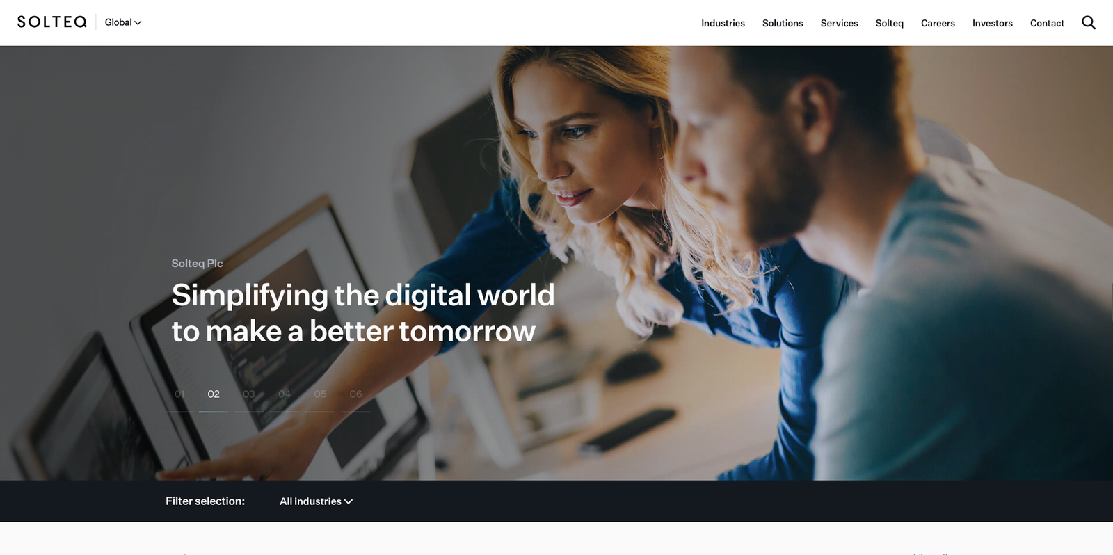
- 8
- years of continuous cooperation, since 2018
- 3
- full redesigns, each rebuilt close to the ground up
- 100+
- modules built, maintained and documented
- 5
- languages the website is built to run in
The brief, every time
We build it into something the team can operate.
A design file shows one page in one state. A listed company’s website needs the same components to hold up across hundreds of pages, in five languages, filled in by people who have never opened a code editor.
That gap is the work. Every module gets the states the design didn’t draw: empty, overflowing, one item, twelve items, no image, a headline three times too long, Finnish compound words that don’t break.
What a module ships with
Editor fields, named in plain language
Not “module_variant_2”. If a marketer can’t tell what a field does, it will be filled in wrong.
Sensible limits instead of instructions
A grid that only accepts three or six cards can’t be broken by adding a fourth.
Every language in the same template
One module, five locales. No forked copies drifting apart over the years.
Behaviour under real content
Tested empty, tested overfull, tested with the image missing, because all three happen.
The hardest module
The navigation
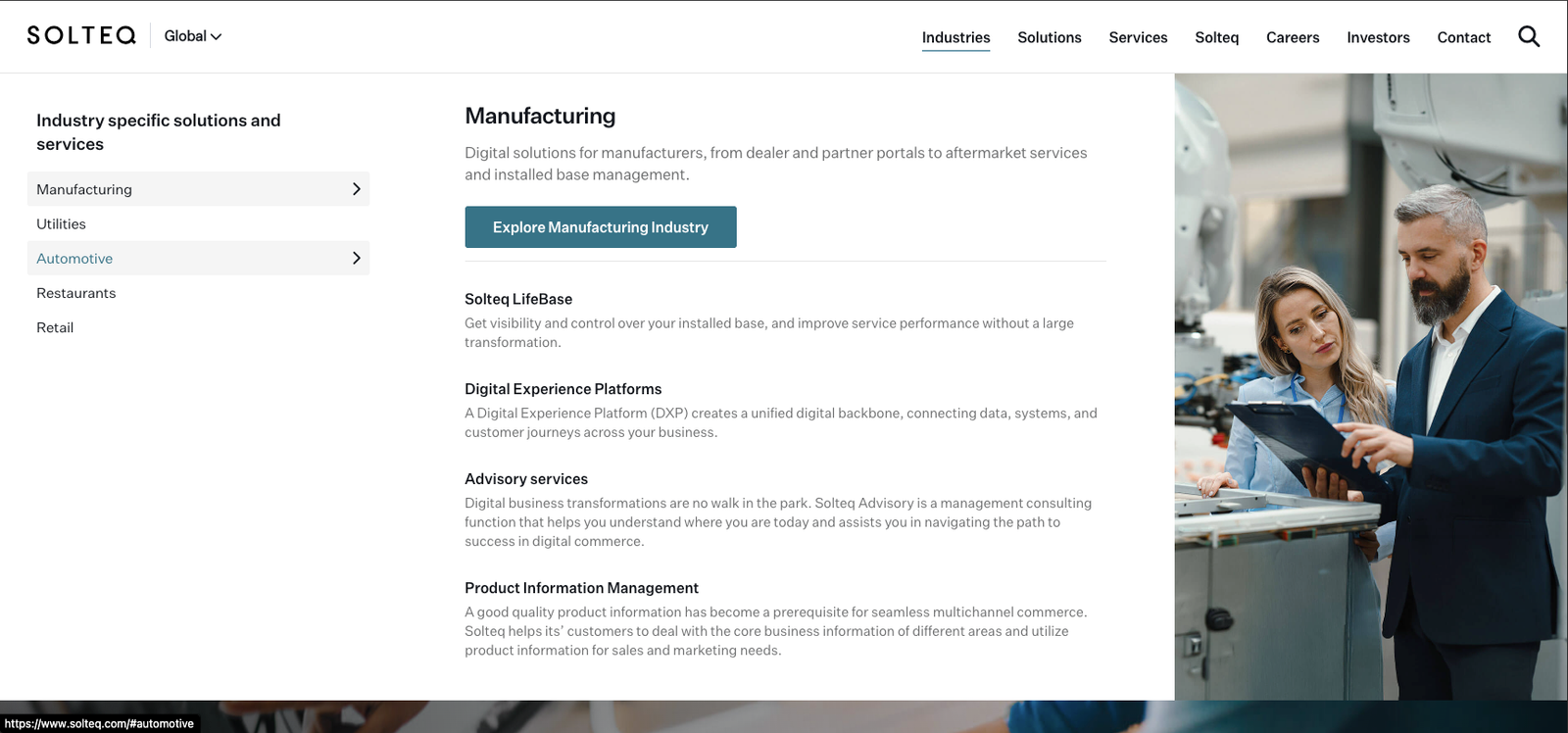
Same modules
On a phone
No separate mobile templates. Each module carries its own small-screen behaviour, so an editor can’t create a page that works on one and breaks on the other.
The same applies to the navigation: at phone width it becomes a drill-down with back steps, driven by the same content as the desktop panels.

Hundreds of pages we never touched.
Solutions, services, industries, success stories, blog posts, podcast episodes, investor reports, campaign pages. The overwhelming majority were assembled by the client’s own marketing and communications people.
A module library is only good if the people using it every day stop asking the developer for help. That’s the shape this relationship has: they build, we extend the library when something genuinely new is needed.
Three redesigns in, the site has never gone quiet waiting on us.
More references
Got a design that needs to become a system your team can run?
That’s the work we do best, whether the design is yours, ours, or someone else’s entirely. Tell us what exists today and we’ll tell you what it would take.